Mixing and Matching Blue Fabrics: Colour Theory Guide4 November 2024
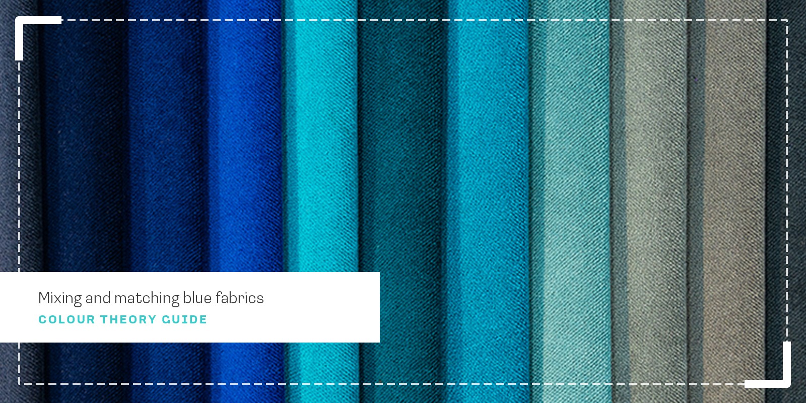
Selecting and combining blue fabrics can be a daunting task, given the wide range of shades and undertones available. How do cool, true, and warm blues differ, and what moods do they create in a space? In this guide, we'll explore the unique characteristics of various blue hues and provide practical tips for successfully incorporating blue fabric into your projects. The different shades of blue and how they can make you feelCool Blues:  Cool blues often contain subtle green undertones, creating a refreshing, peaceful feel. Think of aqua blue, cerulean, arctic and seafoam blues. These colours naturally produce a sense of serenity and are perfect for creating calm, peaceful spaces. Cool blues work exceptionally well in bedrooms and bathrooms. True Blues: True blues, such as navy, royal blue, and cobalt, are not significantly influenced by the undertones of other hues, hence the name "true blue". These classic shades of blue evoke a sense of professionalism and confidence, making them suitable for business and formal settings. True blues are also incredibly versatile and can be used as a foundation for various colour schemes, pairing well with neutrals, brighter accents, and even metallic tones like gold or copper. Warm Blues:  Warm blues feature unique shades with subtle purple undertones, including indigo, periwinkle and violet-tinged blues. These colours create a sense of depth and richness, perfect for adding drama to your projects. Use warm blues to create cosy, intimate spaces and pair beautifully with wooden furniture and warm metals. 5 Blue Fabrics Project ExamplesTo help you understand how to apply these blues to a fabric project, we've created some project examples with different approaches to using blue: Modern Throw Pillows: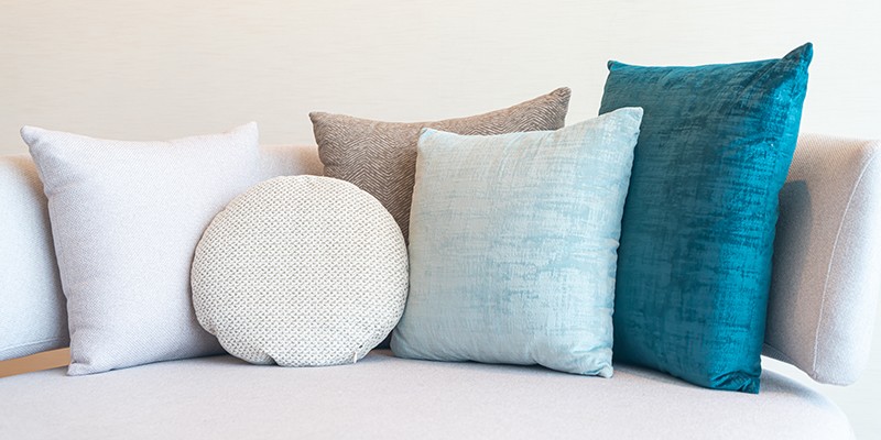 Create a sophisticated ombré effect with our Teal Velvet, Powder Blue Linen, and White Cotton pillows. This monochromatic progression shows how varying textures and shades of blue can create visual interest while maintaining a calm, cohesive look. Adding neutral tones through the Textured Cream Round Pillow adds depth without disrupting the peaceful colour story. This combination demonstrates how blues can transition smoothly from bold to subtle, creating an effortlessly elegant arrangement. Patchwork Table Runner: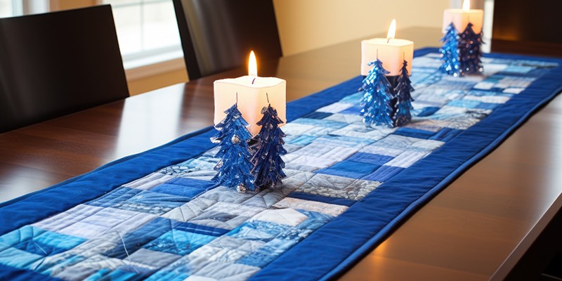 Capture a winter wonderland feel with our mosaic of Royal Blue Cotton, Ice Blue Print, and Silver-Grey Cotton fabrics. Unlike our previous complementary colour scheme, this design stays within the cool blue family, creating a frosty, harmonious effect. The darker blue border frames the pieced centre beautifully, while varying shades of blue and grey create depth through tonal variation. The result is both seasonal and sophisticated, showing how multiple blue prints and solids can work together to create a cohesive design. Structured Tote Bag: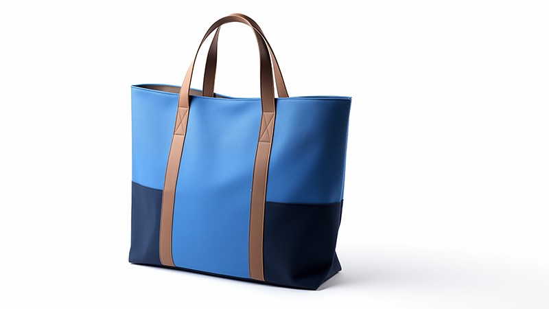 Take a modern approach to colour blocking with our Light Blue faux leather for the upper body paired with Navy faux leather for the base, united by warm Tan Faux Leather straps. This analogous colour scheme creates a sophisticated balance, while the contrasting base adds stability to the design. The structured format and crisp material transitions showcase how different blue tones can work together in a refined, contemporary way. Chair Slipcovers: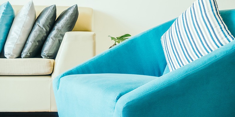 Brighten your dining space with our Turquoise Cotton Velvet slipcovers, showcasing how cool blues can create an inviting, airy feel. The clean lines and full coverage design allow the colour to make a quiet statement, while coordinating with Blue Striped Cotton cushions adds rhythmic pattern interest. This combination offers a fresh take on dining room seating that feels both sophisticated and welcoming. Contemporary Bean Bag: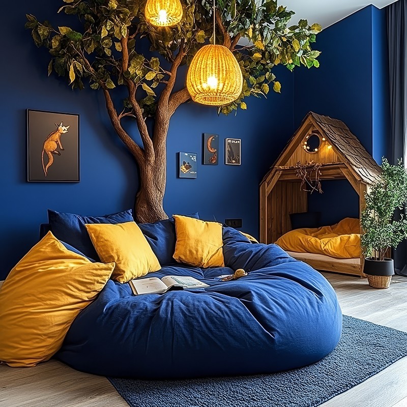 Create a cozy reading nook by anchoring your space with our Navy Bean Bag Fabric as the foundational piece. While the beanbag itself maintains a clean, single-colour design, its rich navy tone creates the perfect backdrop for mustard yellow cushions and warm lighting accents. The specialised bean bag fabric ensures both comfort and structure, while its deep blue colour demonstrates how a single, well-chosen blue can ground bolder accent colours in a contemporary space. Practical Tips for SuccessWhen working with blue fabrics, keep these professional insights in mind:
Ready to start your blue fabric project? Explore our collection of blue fabrics to find the perfect combination. Need personalised advice? Contact us for help with fabric projects using blue fabric. Remember, whether you're working with cool, true, or warm blues, each shade brings its own character to your project. The key is understanding and consciously using these characteristics to create the desired effect.
|
